
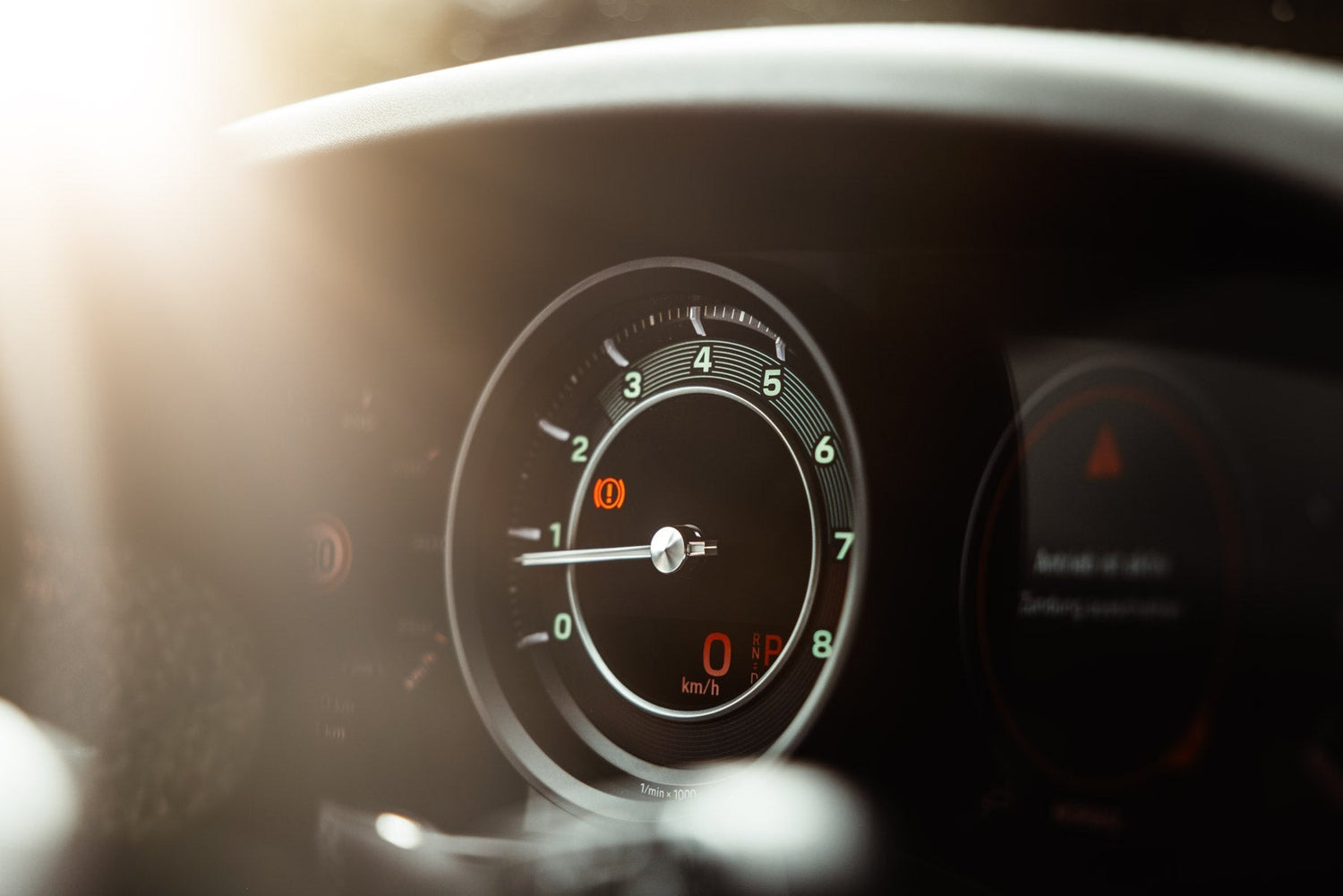
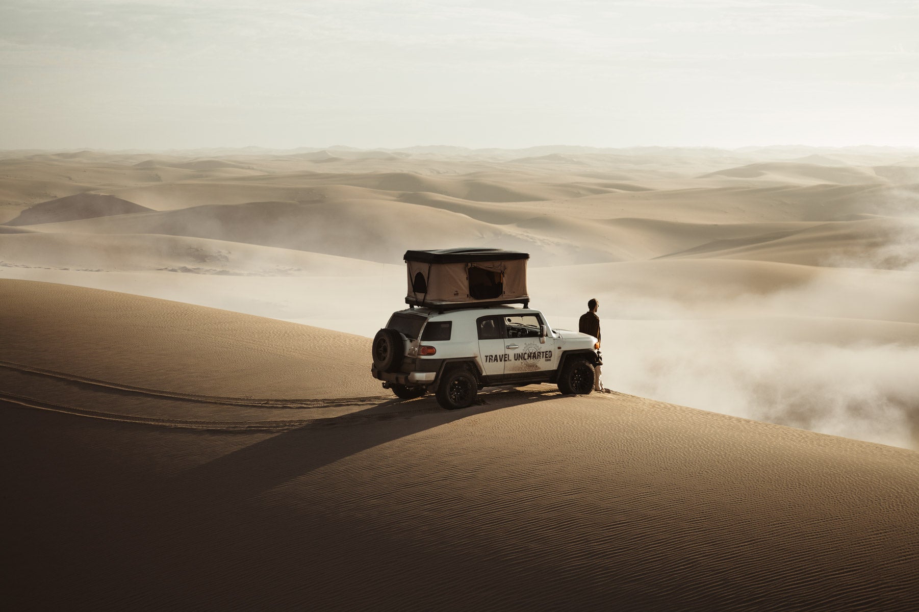
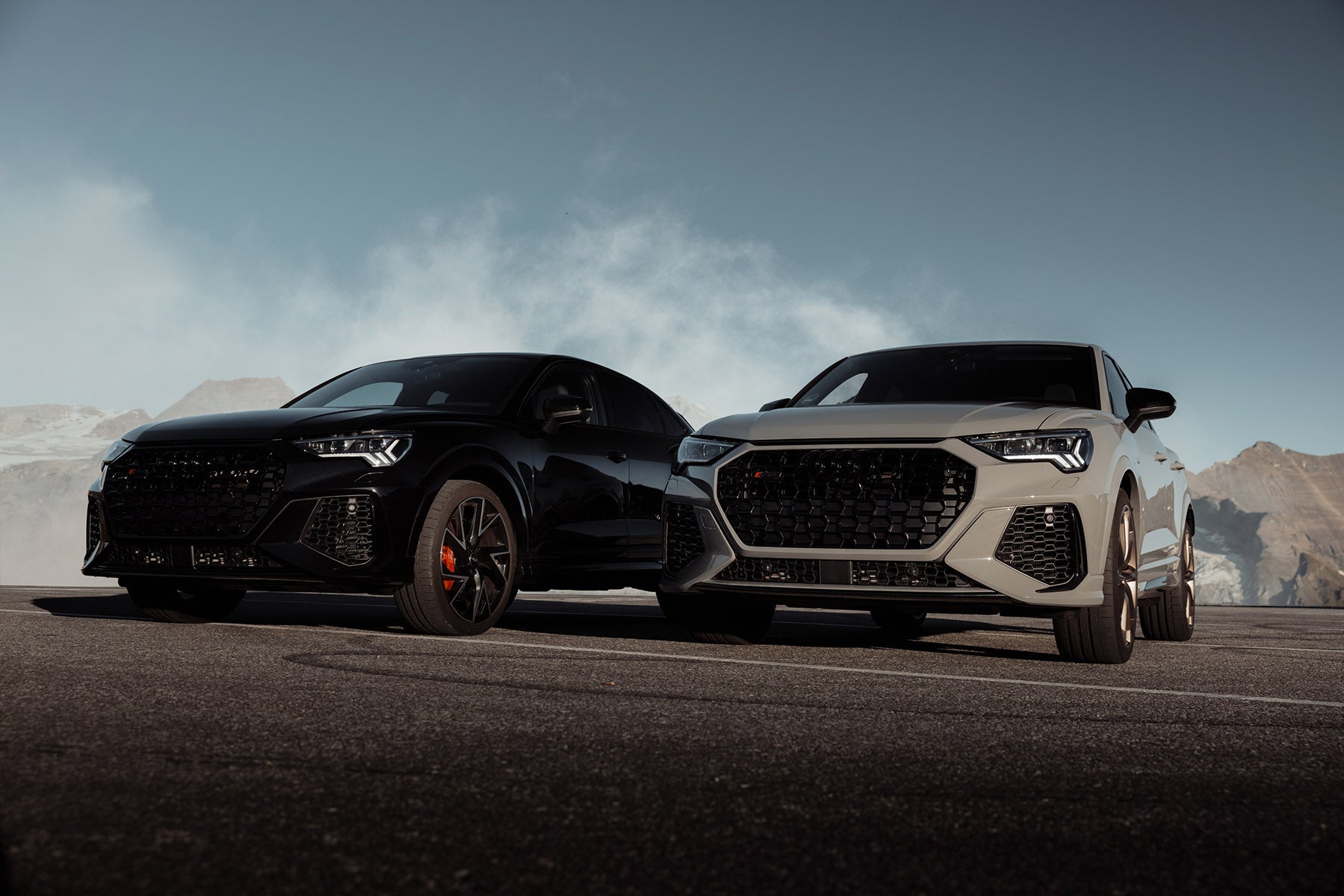
I love shooting car interiors. I’m not into those super-clean, softbox-lit shots that make everything look like it’s been vacuum-sealed and sanitized. Nope. Give me edge. Give me drama. Give me shadows that look like they have a backstory.
Car interiors can be pretty bland subjects but with the right lighting and a little Photoshop magic, they can look cinematic. That’s where overlays come in.
Overlays are my favorite way to turn up the grit without going full Michael Bay. Whether it’s a subtle glass reflection, a rogue light flare, or a hint of lens distortion, they can bring a flat image to life and help guide the viewer’s eye exactly where you want it to go.
But, and this is important, with great overlay power comes great responsibility. Overdo it, and suddenly your tasteful photo looks like a J.J. Abrams fever dream. So here are a few quick rules to keep your shots looking cool, not chaotic:
-
🎯 Focus first: Decide what you want the viewer to look at. Everything else should support that.
-
☀️ Respect the light: Know where your light is coming from in the image. Your overlay should match it, not fight it.
-
🎨 Match tones: Your overlay shouldn’t look like it crash-landed from a different universe. Adjust color and contrast so it blends seamlessly.
-
🧂 Easy on the seasoning: More isn’t always better. Sometimes a single well-placed overlay does more than a dozen screaming for attention.
Below are a few examples, all done in Adobe Photoshop Beta. No AI trickery, just layers, blending modes, and some good old-fashioned pixel wizardry.
Products used: Anamorphic Pro ATMOS Pro Suite
Mood used: Edgy-but-in-control


Leave a comment
This site is protected by hCaptcha and the hCaptcha Privacy Policy and Terms of Service apply.